
OGILVY HEALTH
Branding & illustration & Motion Direction
Branding & illustration & Motion Direction
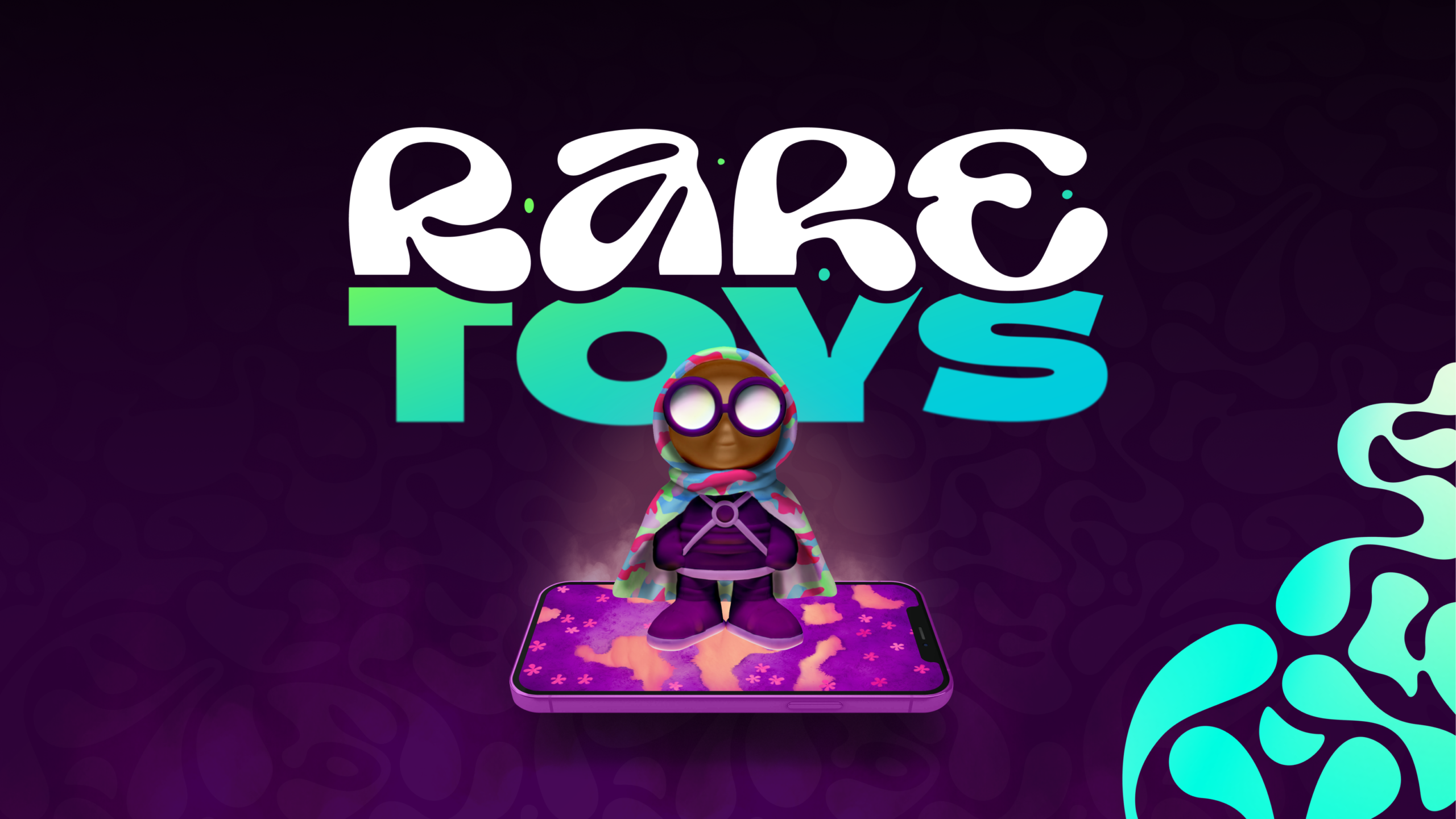
’Rare Toys’ provides an engaging interactive learning experience to help combat any feelings of loneliness they may have after their diagnosis. A multi-sensory toy that brings together various senses to create education that lasts in their memories.
Designer: Flynn Shore
Creative Director: John McPartland
Production Director: Ian Hammond
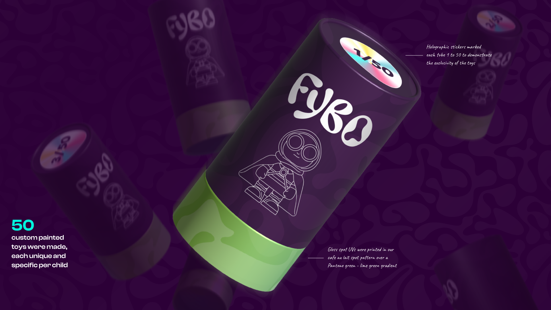
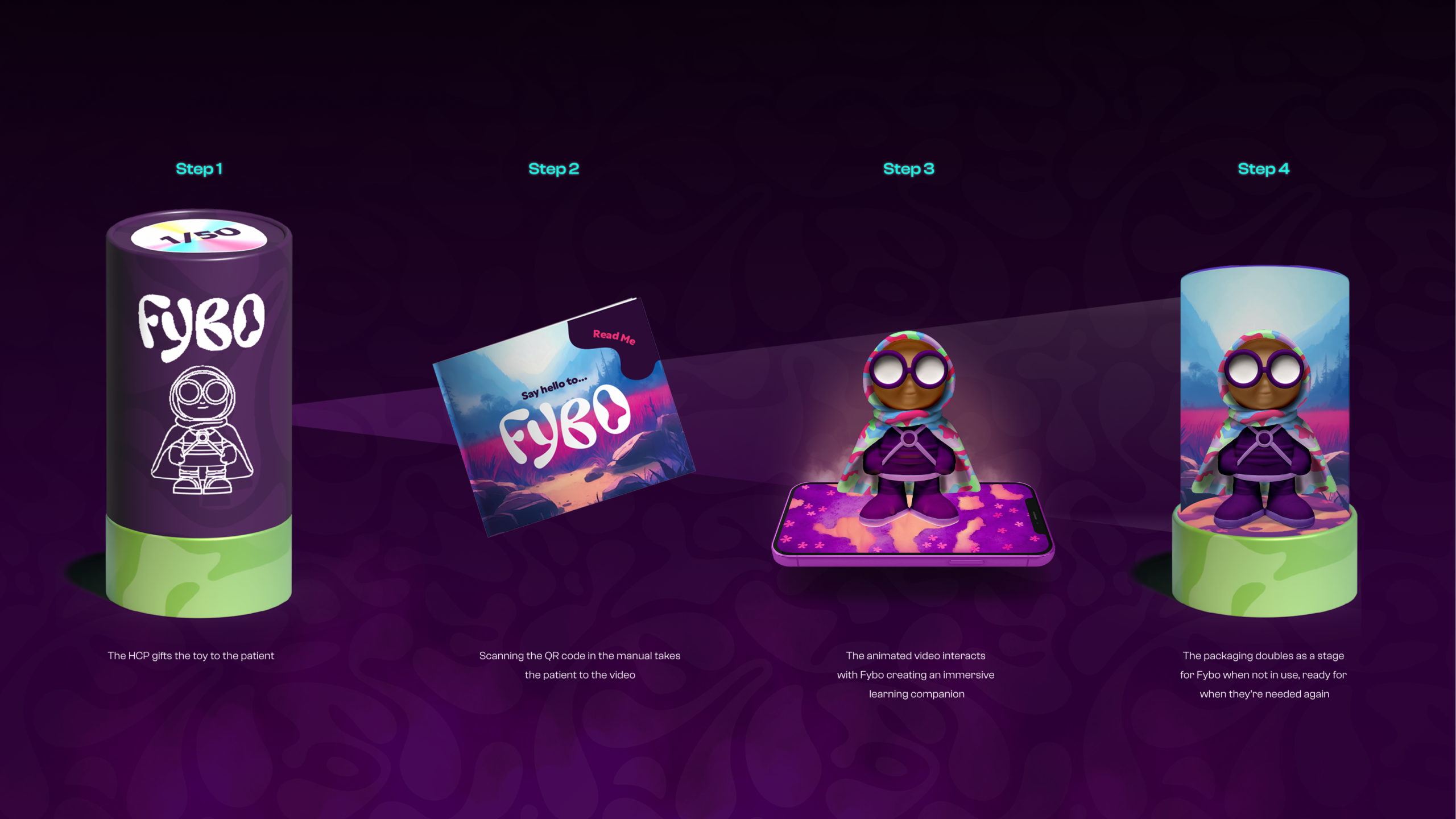
As many children diagnosed with NF1 have learning difficulties it was important we tailored the learning experience to their needs. To do this we commissioned a set of 50 custom painted toys, unique to each patient. This character would interact with the caregivers screen to educate the children in a fun way, keeping the approach light and fun.
increase in attention and motivation during lessons for
students who learn using multisensory methods experience
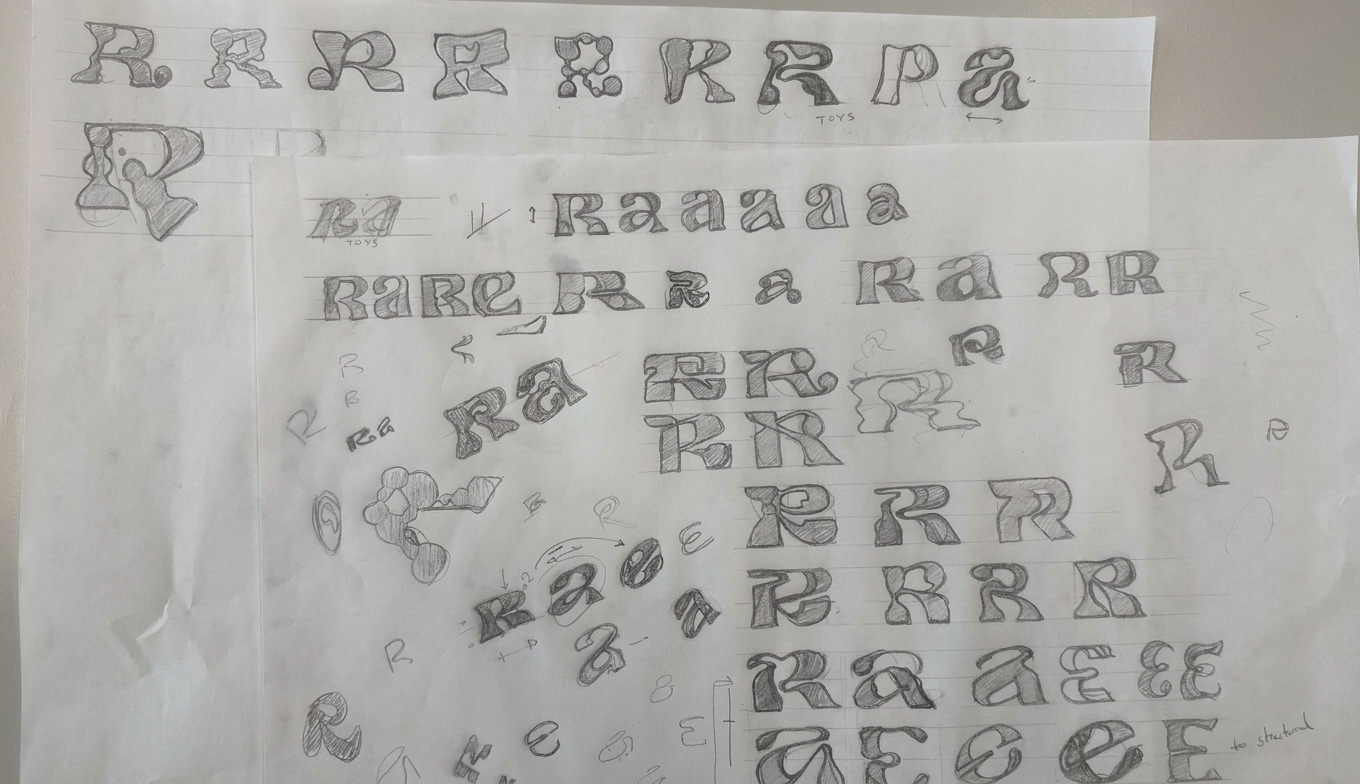
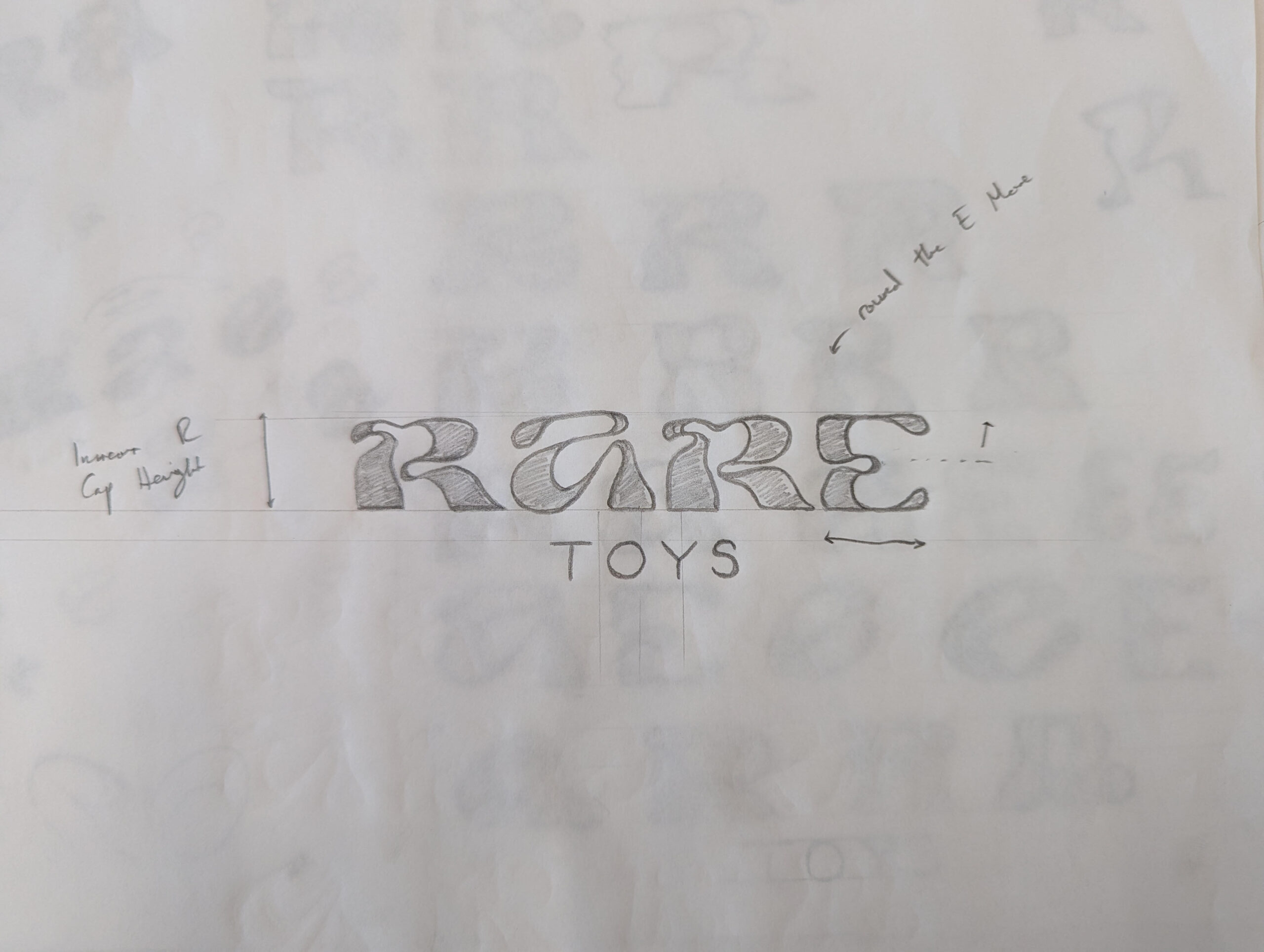
Creating the logotype began with pencil explorations of how we can integrate the fluidity of the cafe au lait spots, a prominent sytom of the ailment, into a dynamic word mark. We then looked at how we can manipulate the type to gain more personality; is it confined to a box, do elements jump about, do we crash letters into each other etc.
Fybos packaging used a simple clean mono-line illustration and a type treatment ,taken from the ‘rare toys’ lock-up, as the headline copy to balance against the more complex interior.
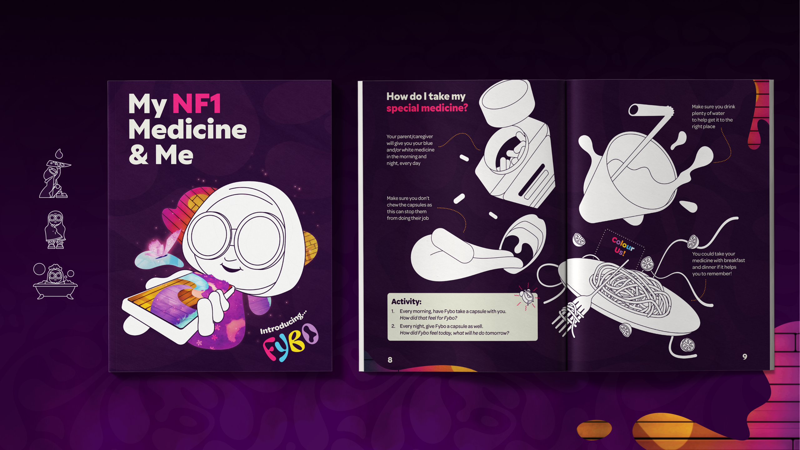
The Healthcare Professional also gave the patients caregiver a separate A4 booklet that goes into more detail on the medicine. This was designed to double as a colouring book to appear more like an activity book
than a cold manual.
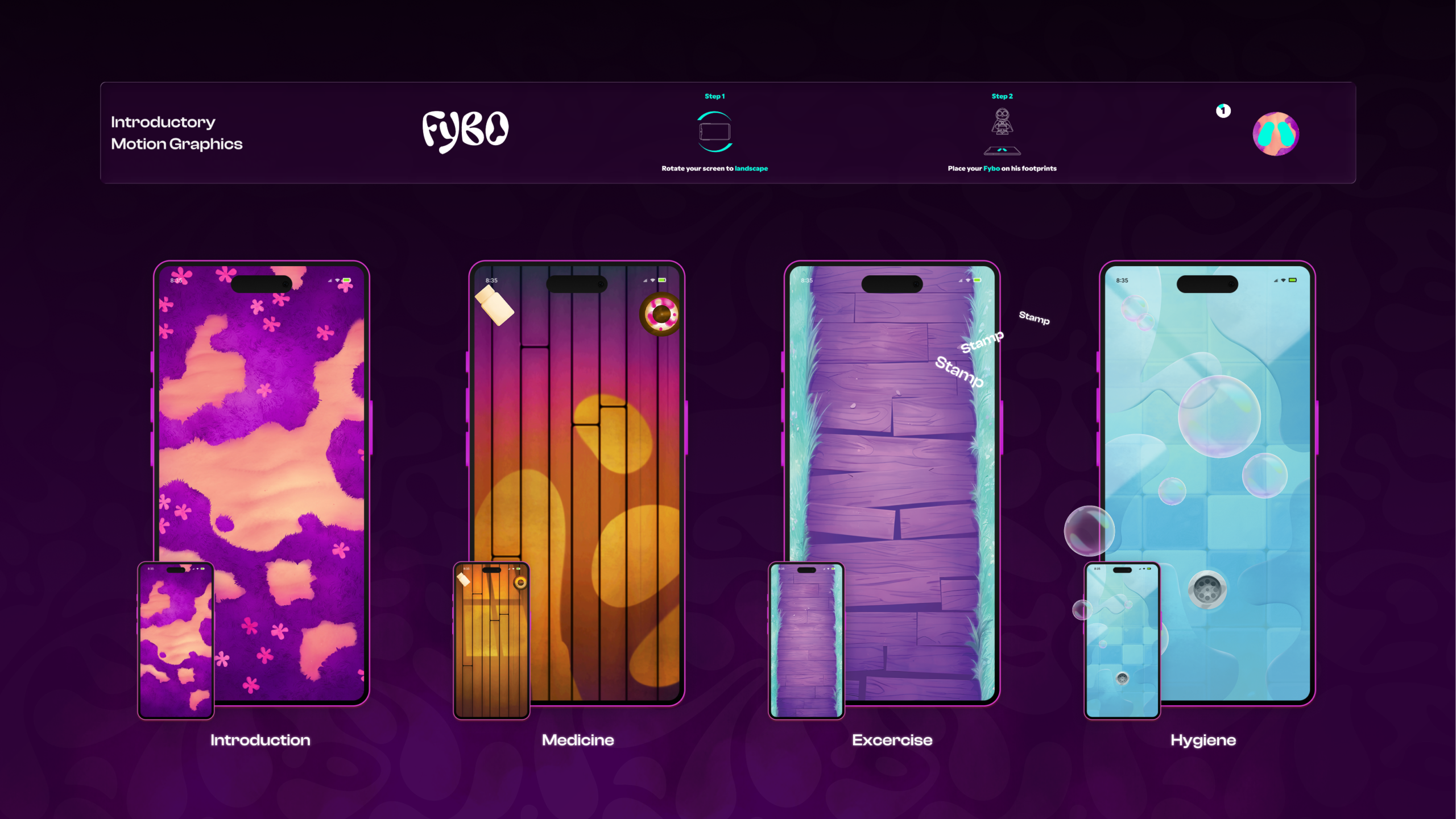
Linking from the QR Code led the child to a one of two videos, age dependant. This turned any phone into a interactive learning experience, with animated floors guiding the patient through their day. Each section introduced a different topic from their day, from the medicine taken through-out the day and their bathing routine.

© Flynn Shore 2026