
PERSONAL
Branding, Strategy & Type Creation
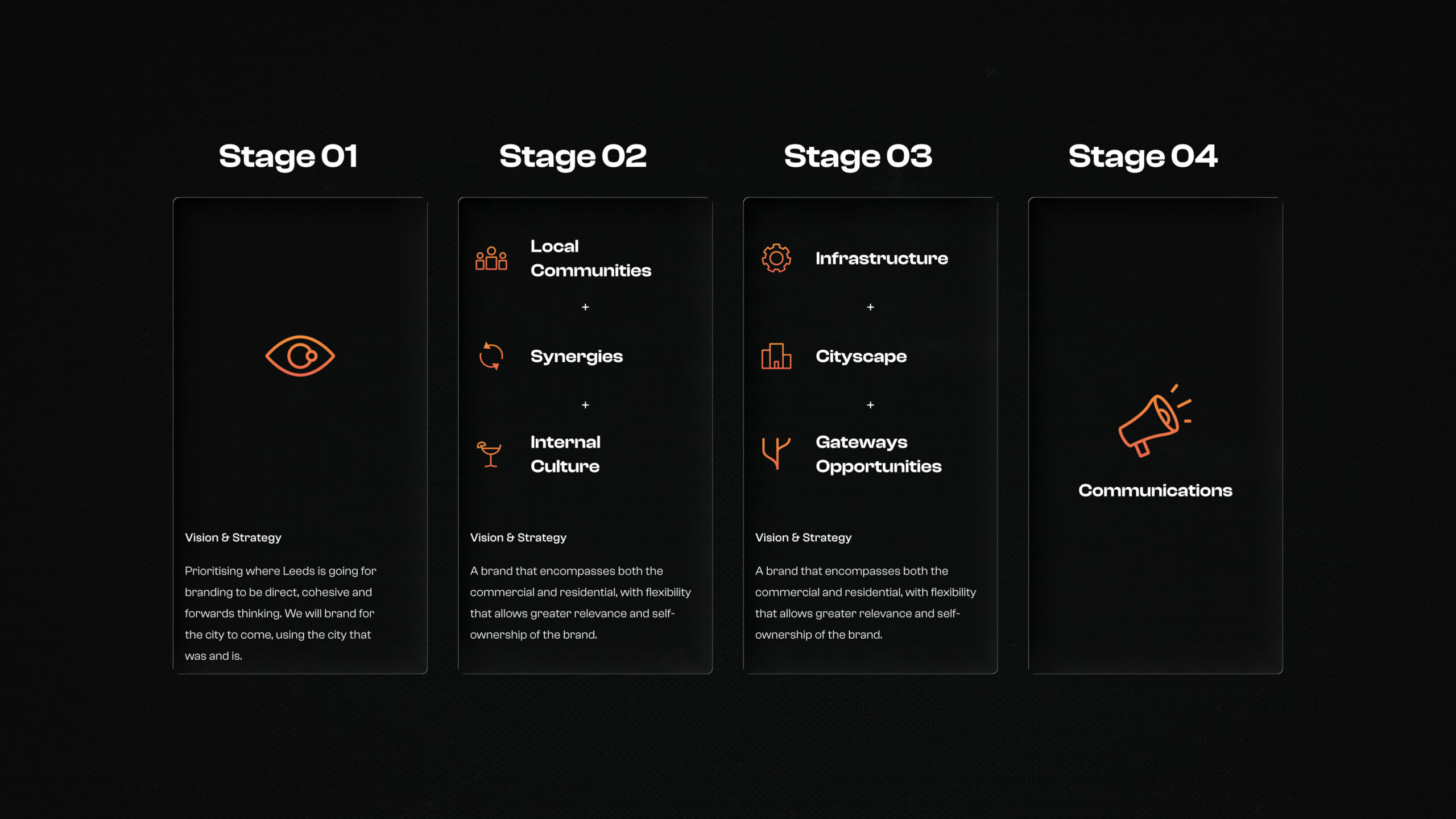
This model starts with the intention of the brand, to represent and portray the city in the best and most accurate manner. Stage two examines the local community, internal culture and businesses and how they view and interpret the city, so the brand comes from the people rather than being imposed upon them. The vision is then amended, with these considerations in mind. Progressing from that, the cityscape, infrastructure and opportunities available are examined, and how these are reflected within the branding is taken into consideration. This leads to the final vision and strategy that manifests as the final identity communication.
This was a branding project where the client has been running a small business teaching music to local adults and children since 1998. The brand uses this heritage and a connection to the local area through hand-drawn illustration, inviting colours and a bold legible logo.
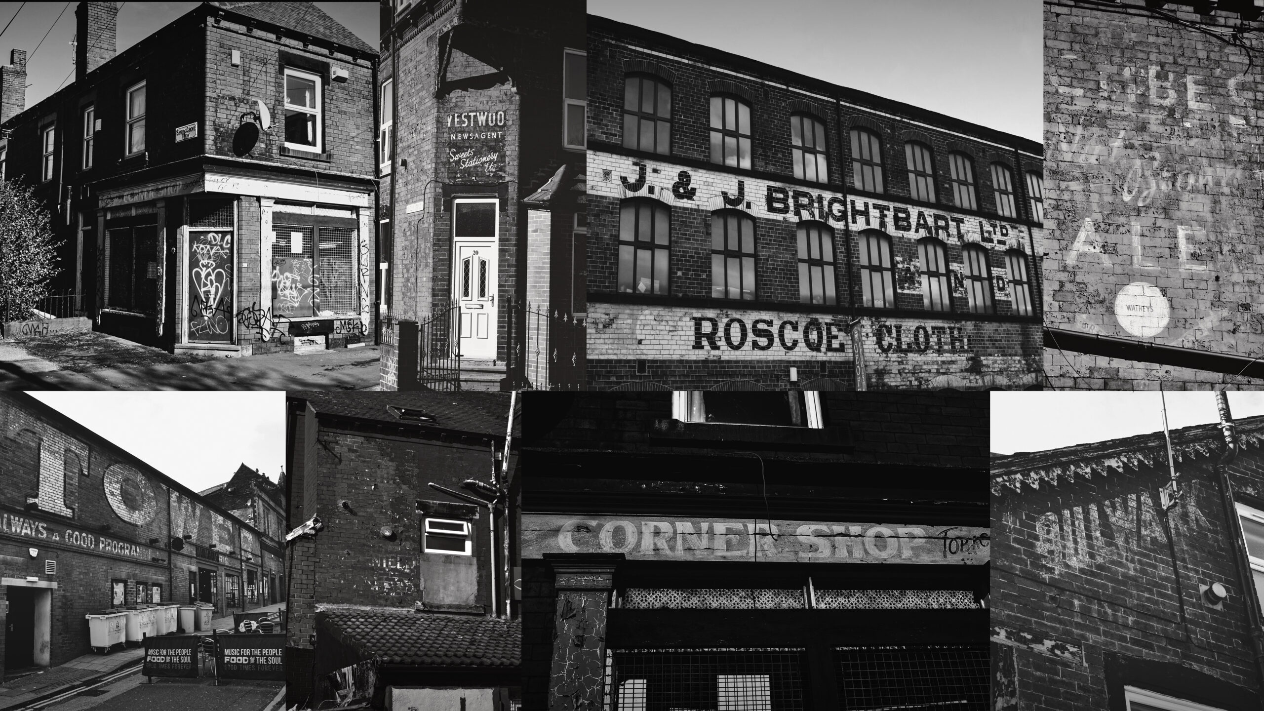
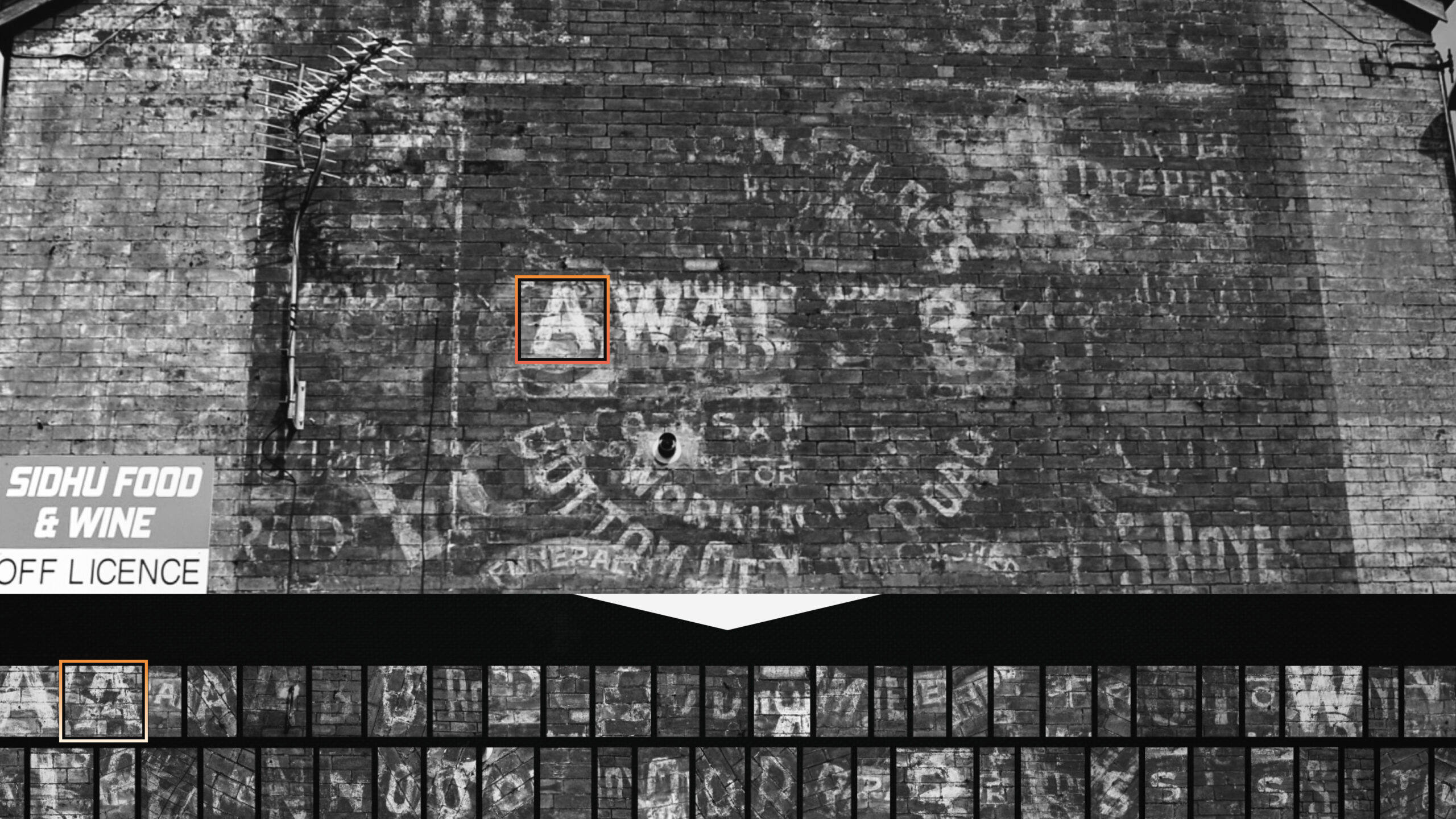
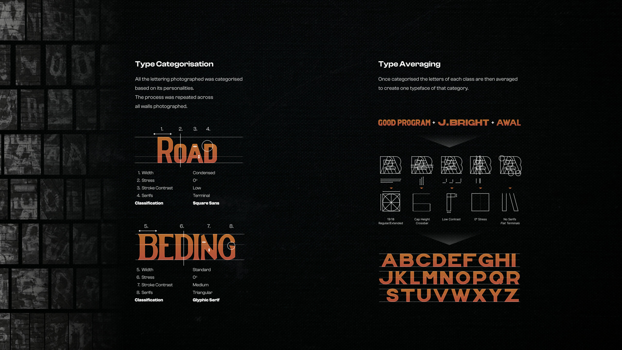
Travelling around Leeds, I photographed, vectorised and categorised the ‘ghost signs’ of Leeds. The visual identity was then built from this existing visual landscape, from it’s industrial heart and heritage.
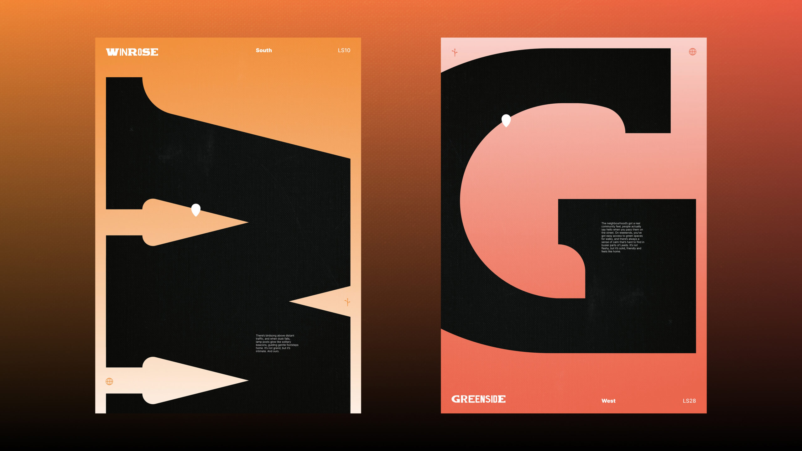
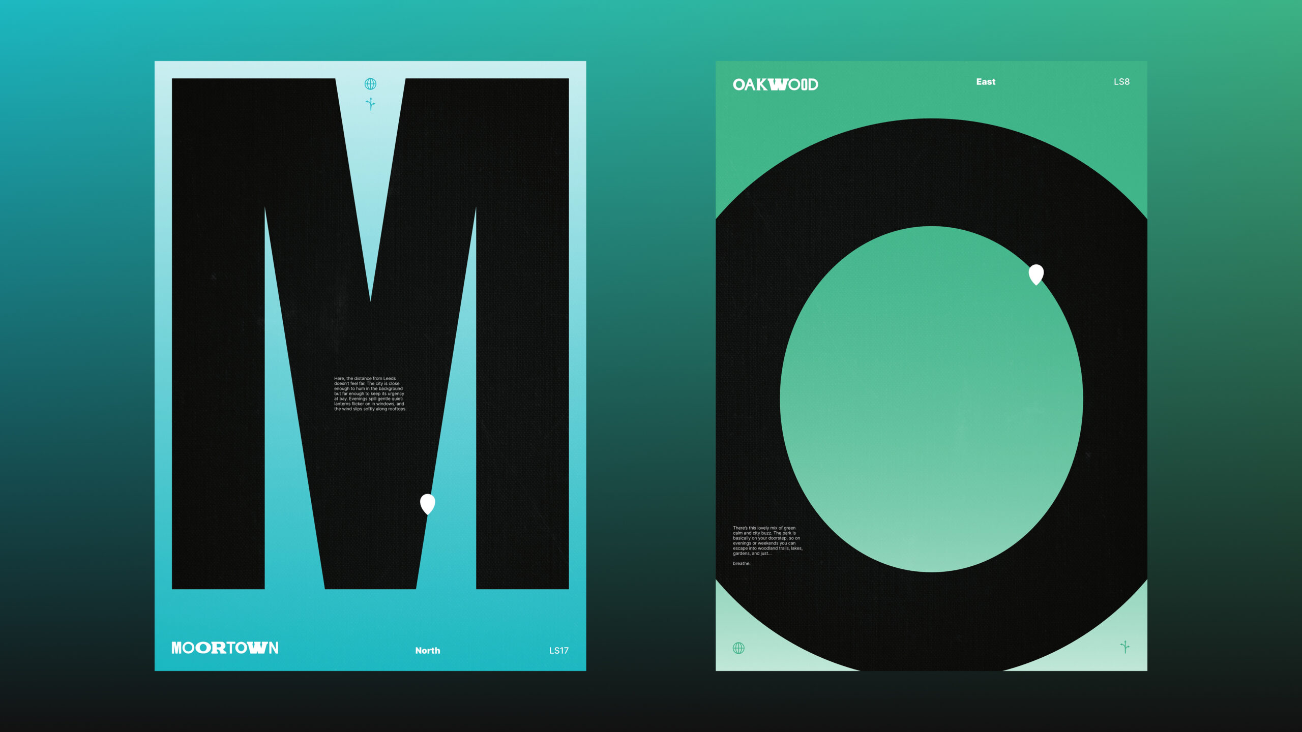
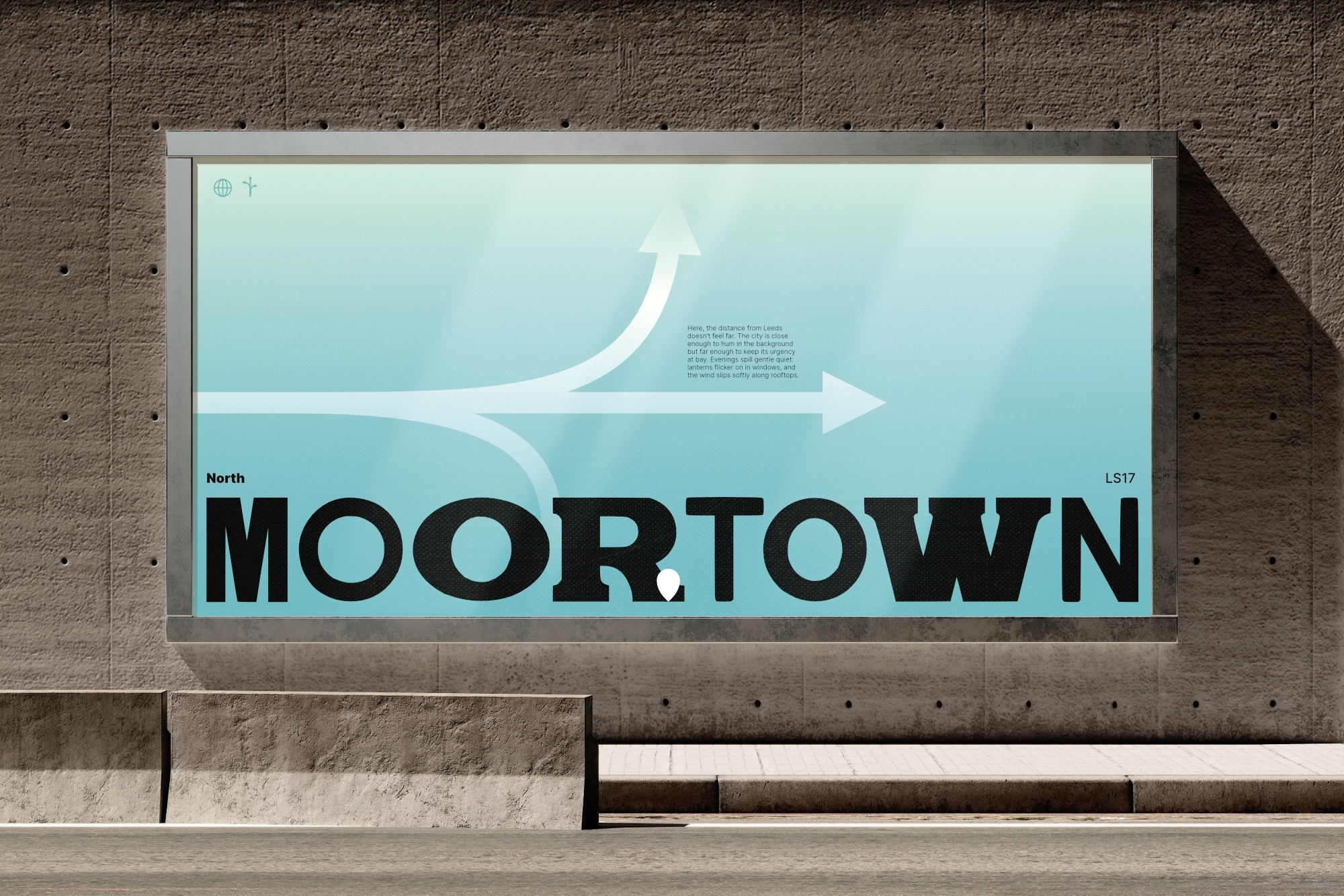
The four sections of the city are each given their own colours so, while they sit within the wider umbrella, they each can feel communal and proud of their area.

© Flynn Shore 2026