
LEEDS FINSIGHTS SOCIETY
Editorial branding
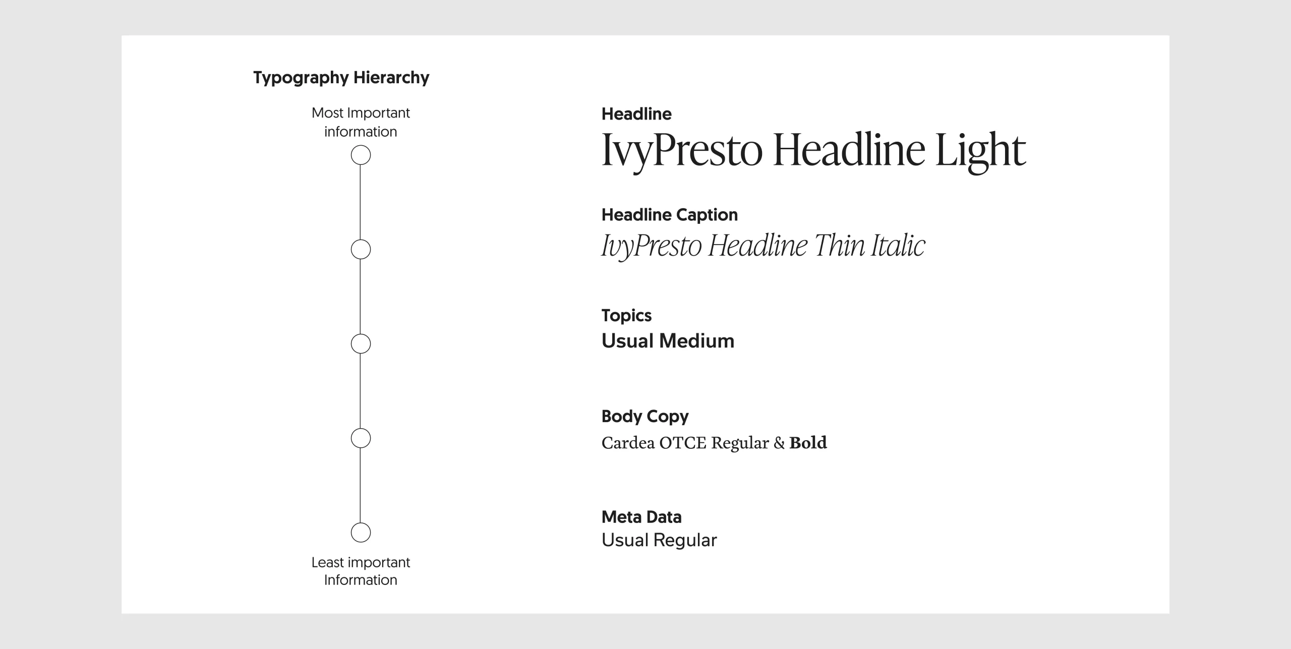
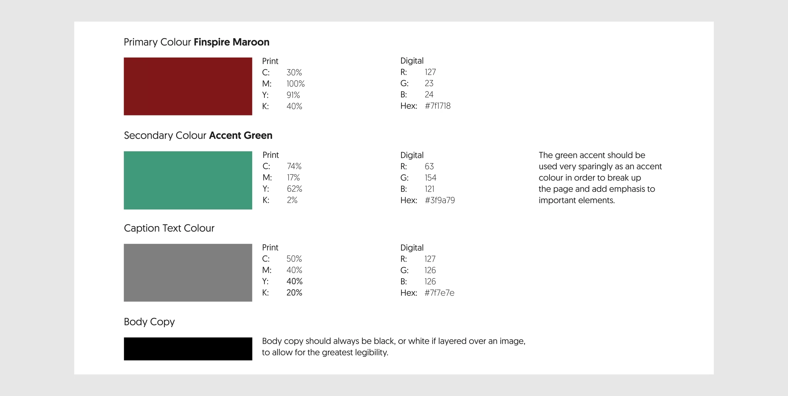
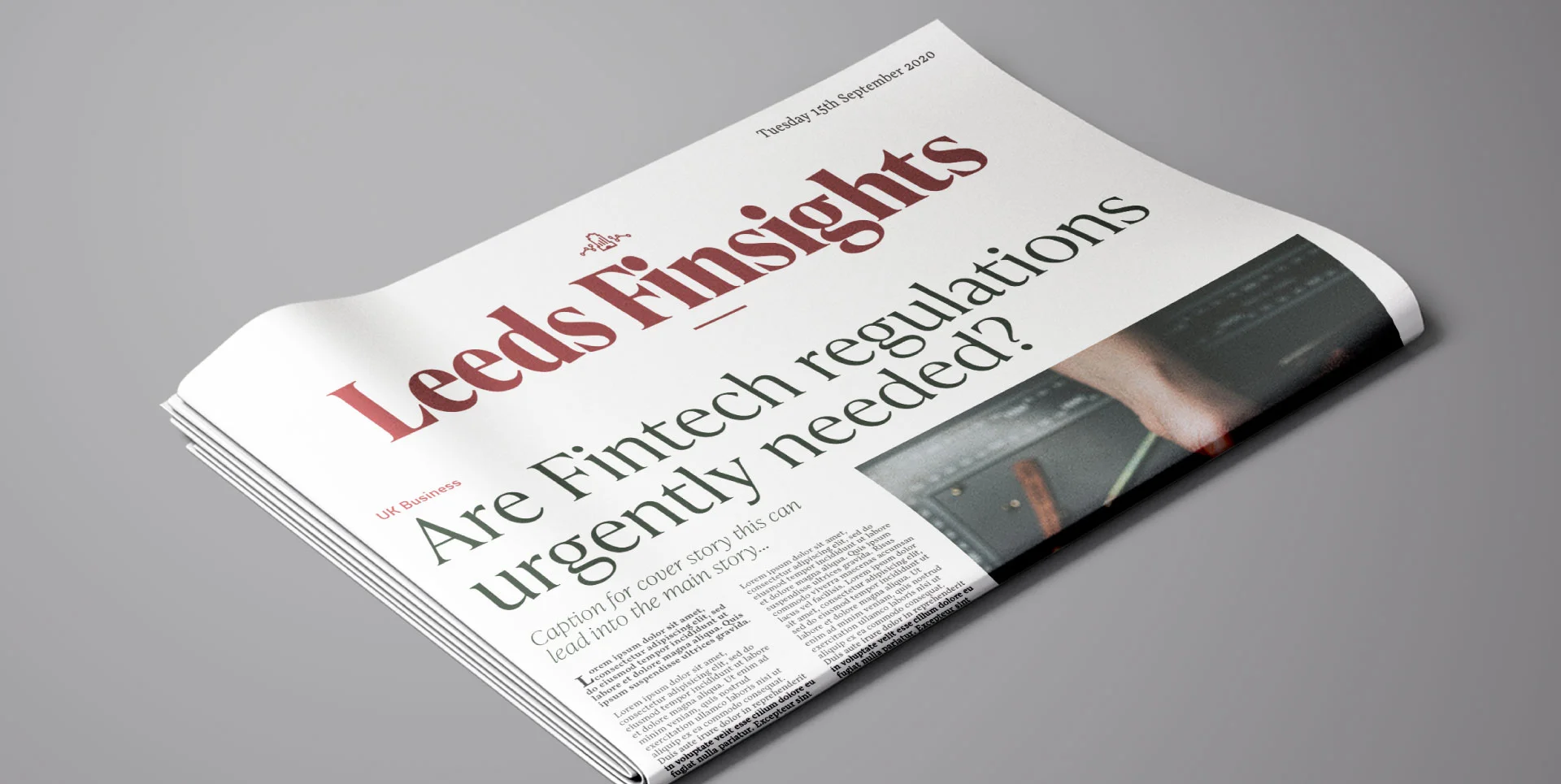
Appealing to a range of readers, legibility was kept at the forefront of design thinking. This ensures that the readers of the bi-weekly publication are informed and absorbed in the content, with clarity and ease of use encouraging repeat engagement. The logo takes from the iconic Parkinson building on the Leeds campus changing the upper windows into a bar chart. Using a responsive brand logo, allows the identity to be used across assets, from the newsletters to the website.
This was a branding project where the client has been running a small business teaching music to local adults and children since 1998. The brand uses this heritage and a connection to the local area through hand-drawn illustration, inviting colours and a bold legible logo.


© Flynn Shore 2026