
PERSONAL
Typography
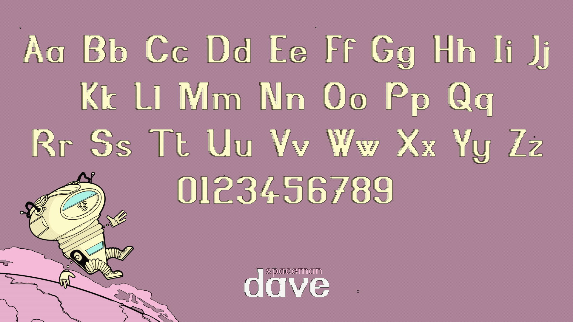
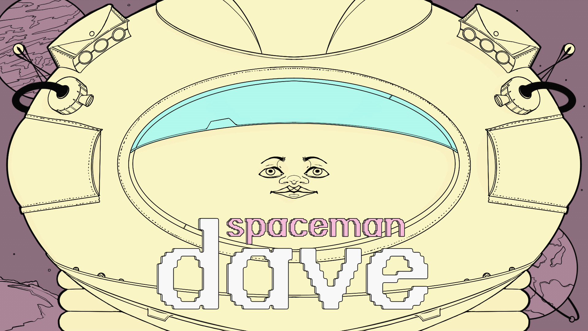
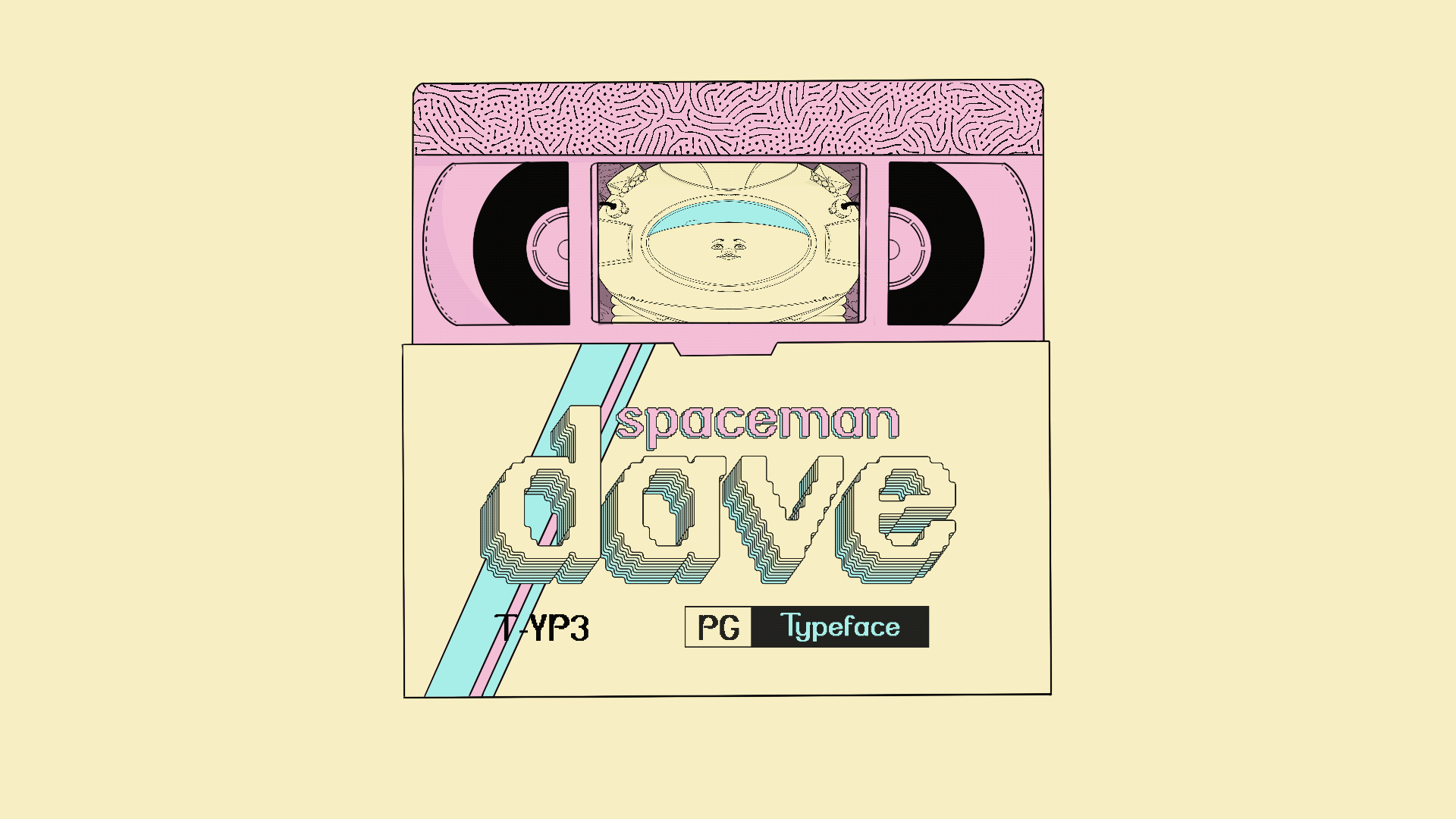
This broke the geometry of sans serif letters into a pixelated simplified font. The pixel size used within the typefaces is smaller than many of the other pixellated typefaces allowing for a font that's more complex and characterful. This typeface was based on a retro-styling for use as a display typeface.
This was a branding project where the client has been running a small business teaching music to local adults and children since 1998. The brand uses this heritage and a connection to the local area through hand-drawn illustration, inviting colours and a bold legible logo.


© Flynn Shore 2026